Durham Food History
Methods
The research process began with determining key themes in the national and regional history of food inequity and then identifying primary and secondary sources specific to Durham, to interpret the unique local story of food inequity around these core themes. Locally-focused scholarship helped clarify local historical timelines, identify key actors and events, and support the analysis of food inequity at the intersections of race and class. Additionally, local memoirs and personal accounts were hugely important to bring key themes down to the level of personal experience. Quotes throughout the report convey larger historical themes through the lens of memory and individual storytelling. New oral histories were completed to help fill in some of the gaps of local recorded memory. Research also included community-based input that occurred through a series of presentations and gallery walks whereby different community stakeholders reacted to initial themes and content and provided feedback. The top recommendation from the gallery-walk was a strong desire for first-person accounts which were incorporated throughout the narrative. To help contextualize the narrative and data original maps and charts were created from sources such as census records, city directories, archival maps, wage and employment statistics, and secondary sources.
The language utilized throughout this report was carefully considered and vetted through a community feedback process. ‘Indigenous Nations’ and ‘Native Peoples’ are used interchangeably to describe the original peoples of this land. ‘Enslaved people’ and ‘enslavers’ are used to describe the relationship of people during the time of slavery. Throughout the report, Black, white, and Latino are adjectives used to describe people, not as nouns, and ‘white’ is not capitalized to invert historic hierarchies.
Figure Data
Figure 14. This map shows the social geography of Durham in 1930.
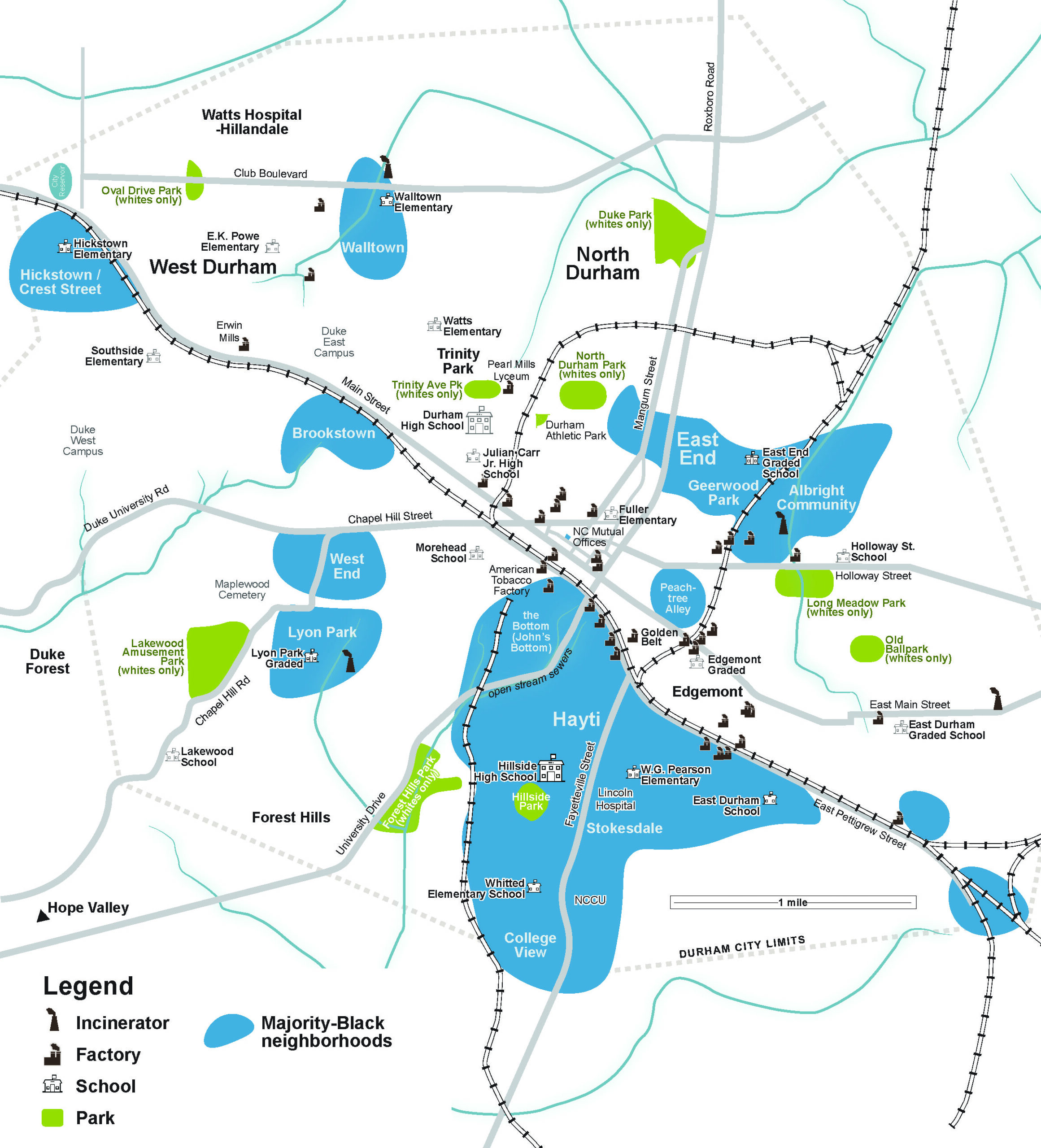
Figure 19. Map showing the distribution and ownership status, either locally-owned or chains, of grocery stores in the city in 1940.

Figure 31. Map showing distribution of public amenities and nuisances in Durham. Black neighborhoods are closer to incinerators and factories and have fewer parks and schools. The red stars indicate neighborhoods with racial deed restrictions. Courtesy Tim Stallmann for Bull City 150.
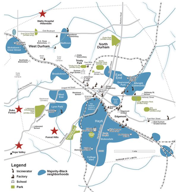
Figure 32. HOLC Securities Map of the City of Durham, 1930s. The redlined areas include all five historically Black neighborhoods, and the poorest historically white neighborhood of Edgemont.

Figure 42. These maps show the differences in grocery store locations and ownership in 1940 and 1980. While there is a dramatic reduction of grocery stores across the city, Hayti and the urban renewal area are strikingly void of grocery stores.
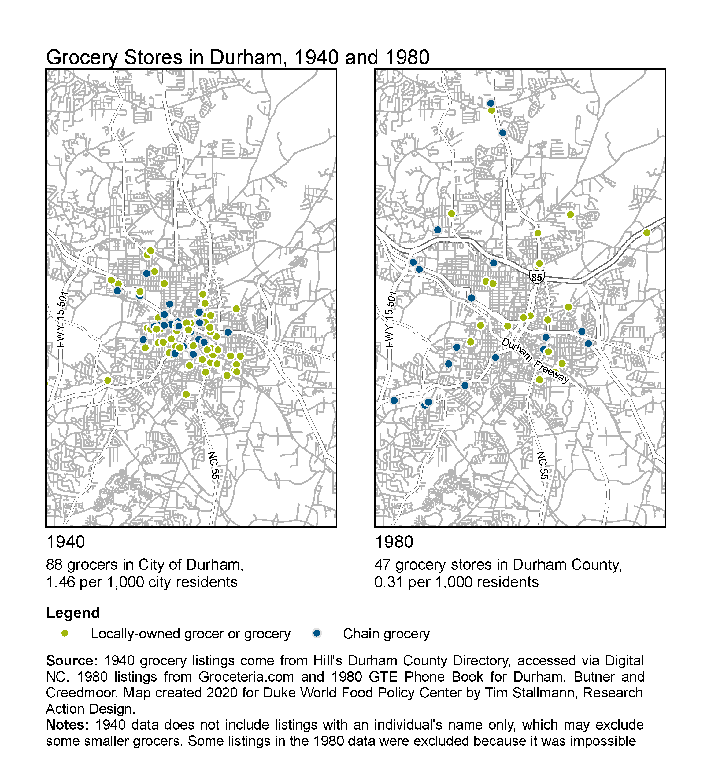
Figure 46. Map of grocery stores in Durham by ownership status in 1940, 1980, and 2020. From 1980 to 2020, there is not a dramatic difference in the number of stores, but a shift in type. There are now several big box and wholesale stores across Durham as well as a number of smaller international or ethnic grocers.

Table Data
Table 1. Percentage of Farmers Owning Their Farms and Average Farm Size for Durham County, 1880-1930.
|
Percentage of Farmers Owning Their Farms and Average Farm Size for Durham County, 1880-1930 |
|||||
| 1880* | 1900 | 1910 | 1920 | 1930 | |
| Average Farm Size (acres) | 115 | 96 | 85 | 76 | 71 |
| Black Farm Ownership | N/A | 9% | 21% | 26% | 20% |
| White Farm Ownership | N/A | 50% | 54% | 53% | 53% |
| *1880 figures are for Orange County, from which Durham County was formed in 1881 | |||||
Table 2. Black Land Ownership Chart 1875 - 2000 and Table 3. US Farms Operated by Black and White Farmers, 1900-1997.
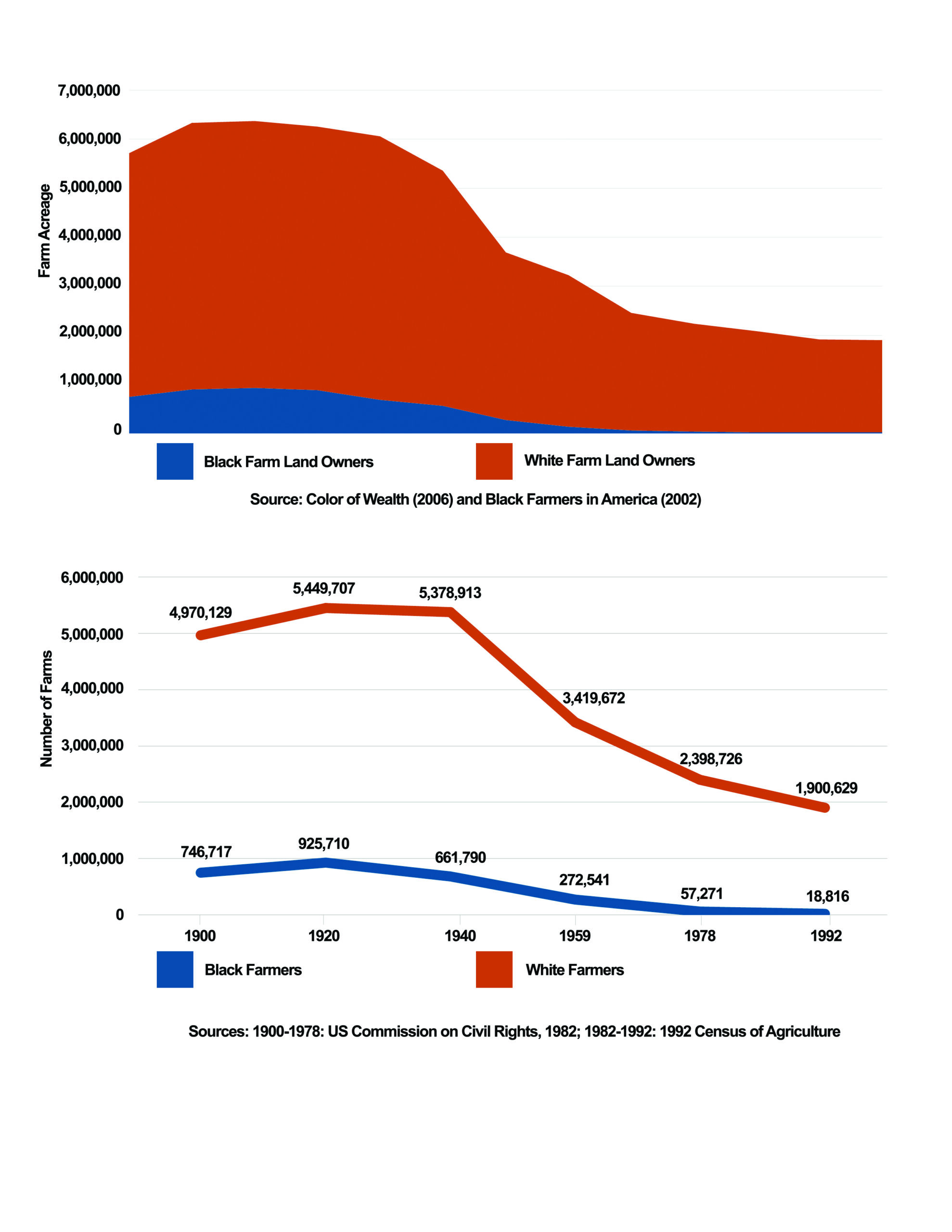
Table 4. Changes in Women Working Outside the Home in Durham Co, 1960 – 2010.
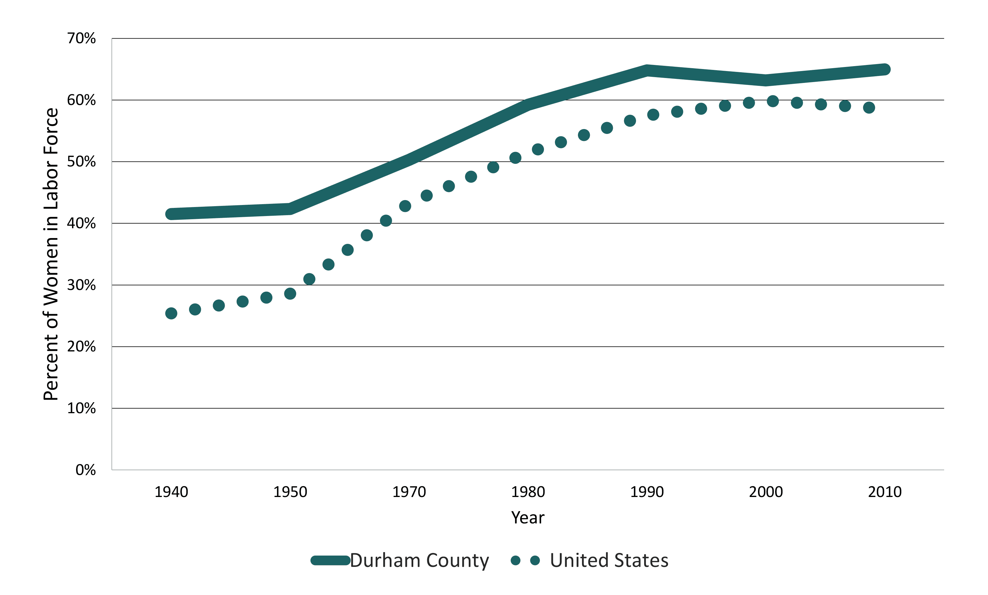
Table 5. Charts of Corporate Consolidation in Food System.
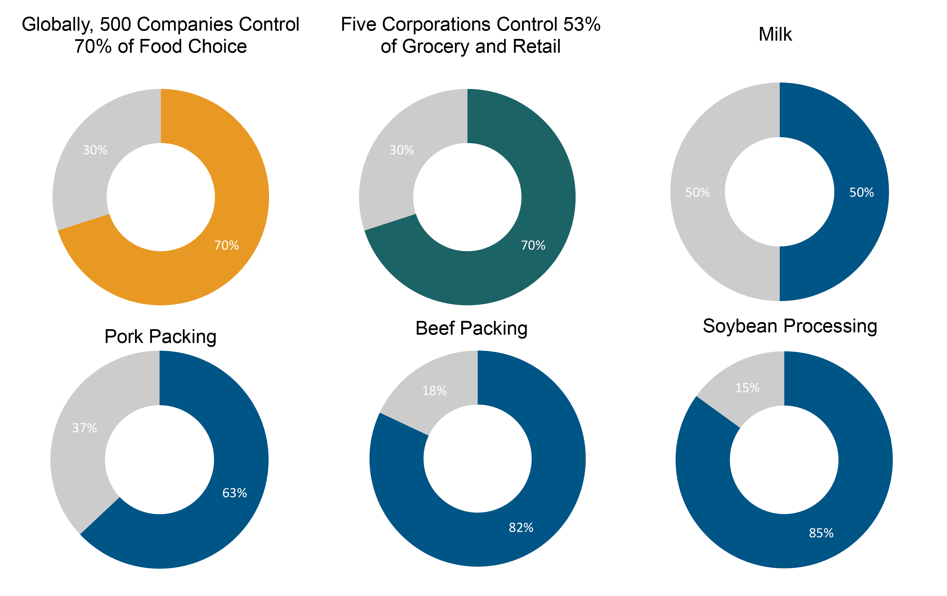
Table 6. Jail and Prison Population Rates, 1978-2015 for North Carolina and Durham.

Table 7. SNAP Benefit Recipients in Durham County, NC 1989 - 2017.

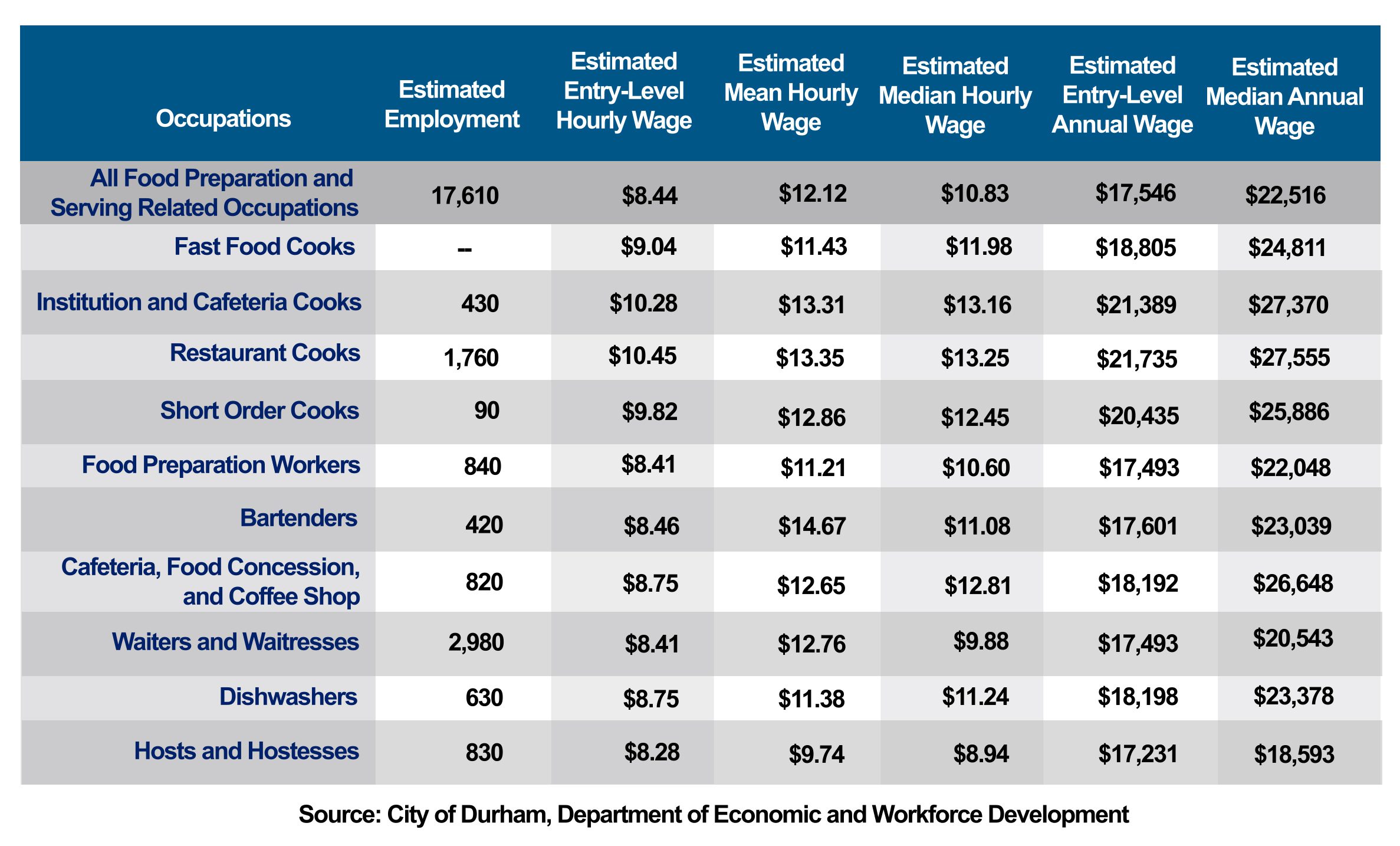
Table 9. Wages for Food Workers in Durham County, 2019.